Proposal Group Members: Ashley Bennett, Sangui Qu, Randi Tollner
Development of the Concept:
As our group was first given the task of coming up with a concept of showing
some form of historical design, we immediately thought about the things found
in every home. We also thought about what most people have, yet take for granted.
Some of the group members mentioned how we could talk about how the style of
the home changes with time. For example, how colors changed from bright and
bold tones of yellow and oranges of the 70s to a more muted natural look today.
In trying to relate this idea of style change to a type of furniture found in
the home, we thought about how patterns on couches as well as its style has
changed over time. Other ideas were also thought about during this meeting such
as table designs over the time span as well as seating change through different
countries. However, we decided to fully devote ourselves to focusing our
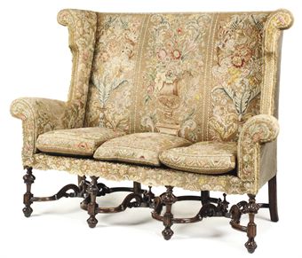
research on the evolution of the styles of couches through changes of pattern,
upholstery, and shape used. Through this concept we would be able to look at
several factors that changes style throughout time: color, textures, materials,
movements, shape, etc. By choosing this concept and by researching these
variables that effect couches we would not only learn about how the shape and
patterns on couches change, but the many different factors and design elements
that cause that change. We're not focusing on the specific time frame in which
it changed, but rather the specific causes that make that change. These changes
could be movements, political event, etc.
What will make this concept
interesting to others is that people will be able to begin to understand why
pattern and shape changes in couches occur. It is in fact, not that someone
just thought of something new, but the many small factors that make it happen.
People will no longer glance over the change and accept it easily, but may
start to contemplate its origins.
Artifacts Group Members: Michelle Baulieu, Caitlyn Whisenant, Sarah
Wisseman, Cory Odell
Objects included in the exhibit:
1930's
Billy Baldwin sofa
Designer Billy Baldwin felt
that the couch was the foundation of any room. It felt that furniture had to
many legs and it made rooms feel very anxious and that they made a room feel
unsettled. This style is still very popular today because it is so simple and
timeless in it’s design. It was very common for this couch to be white, today
this style can be found in an array of colors.
1930 Marcel Breuer
1937
Salvador Dali Mae West Lips sofa
Mae West lips couch is a
piece that was created in 1937 by surrealist artist Salvador Dali. He found her
lips to be very captivating and created a furniture/conceptual piece based upon
them. It was a true fusion of art and furniture and was a groundbreaking
concept of making a couch just as much a piece of art as it was a functional
piece of interior furniture.
1940 Charles and Ray Eames
1948 George Nelson
The 1960s were all about
free love, flower power and pop music but, as the saying goes, if you remember
it, you weren't there. The previous decade's love of American design was
replaced, as London became what was popular and things were “groovy”. The furniture
basically shows how America decided to “let loose”. The idea of comfort was
lost, and whatever was colorful and “loud” was brought in! Art nouveau was an
influence with the whiplash lines and stylized flower shapes. Space age
furniture, such as capsule and pod furniture were popular. Ornamental items
were brought back from India and Morocco.

Furniture from the 1970s
reflected a change from bright and funky furnishings that were omnipresent in
the 1960s.The bright patterns were popular in the 60’s because it was a party
era. Drugs, music, woodstock, war, etc. were all affecting society. The 70’s
brought a change and society calmed down. In the early 1970s, patterned couches
were still present, but earth tones were introduced in every home, but as the
decade progressed, homes became more sleek and modern. Lower styles of
furniture were introduced and the horizontal aspect was more of an influence.
Popular colors to use when decorating were white, chrome, black and brown. The
upholstery manufacturing returned to a more natural, sometimes handmade, aspect
as people in society were returning to nature.
Sources for information:
1)
http://www.housebeautiful.com/shopping/billy-baldwin-collection
2)
http://www.telegraph.co.uk/culture/art/3604018/Object-of-the-week-the-Mae-West-lip-sofa.html
3)
http://www.moma.org/collection/object.php?object_id=4098
4)
http://www.hermanmiller.com/Products/Eames-Sofa-Compact
5)
http://3dnews.wordpress.com/2009/10/07/modern-sofa-daybed- furniture-design/
6)
http://www.bbc.co.uk/homes/design/period_1960s.shtml#influences
http://www.vintagelooks.com/detail.asp?product_id=hw-9812
7)
http://www.vintagelooks.com/detail.asp?product_id=hw-9546
http://en.wikipedia.org/wiki/1970s_in_furniture
Graphics Group: Daniel Salgado, Ayten Nadeau, Anna Hambly
Signage Proposal:
•
Possible 36x24
banners placed strategically outside for the visitors to see
•
Two 30x20
posters will be placed on the glass wall of the Gatewood building
•
The posters
would include one of the silhouettes of our artifacts
•
The posters will
include a quote that defines our exhibition
•
Fonts for the
banners, posters, postcard, and the floor graphics will be chosen based on the entire
artifacts collection
•
6x4 exhibition
program postcards will be available for visitors
•
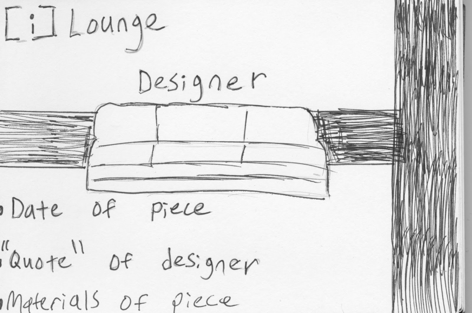
The individual
signage for the artifacts will be made out of acrylic stands
•
The signs for
the artifacts will include the name of the designer and/or the stylistic
period, year, location, size, and a brief description of the couches.
•
The floor will
be utilized for a creating a way-finding path
•
The floor
graphic will contain historical data
•
The floor
graphic will have enough contrast to make it easy to notice
• The exhibition will be advertised throughout the
community with flyers, on UNCG’s homepage, and through social media.